How it all started
In May 2007 Michael Fakesch sent an e-mail with a “call for videos” to accompany his record “dos” for a DVD called “vidos”. The videos should be “strictly no budget”, we were free to choose our subject. I decided to take part but quickly realised I was not equipped to be a video artist: I am a typographer. I am interested in letters, any kind of type, where ever I find it and however it is created: digitalized, animated, drawn, on posters, in films, on business cards, in books, on signage, in public space, anything. I have little experience in producing moving pictures, using video cameras, talking to actors, lighting, 3-D. Therefore I decided to stick to my field of expertise and use type. The concept was born to print a video, to create video that is both a digital sequence of images and a pile of paper.
Two media
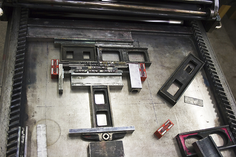
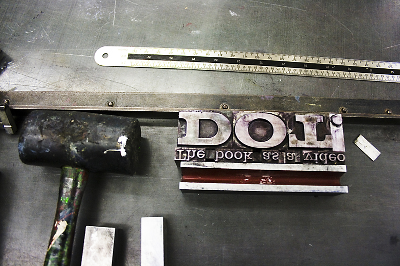
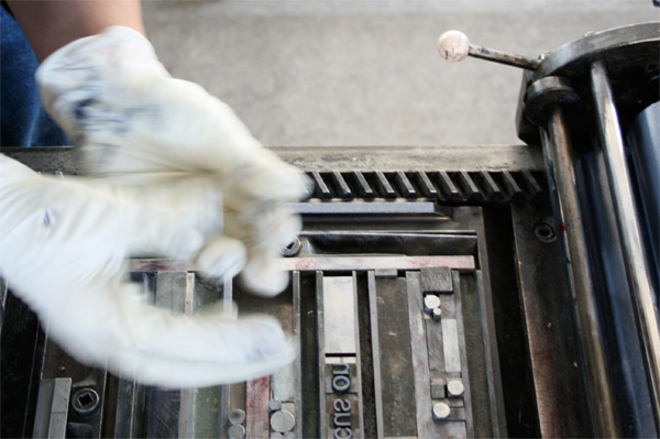
Within the project we simultaneously developed two different media: printed paper that would become a book and be reproduced to create a digital video. Every image shown in the video would be a page in the book. These images were produced using letterpress printing with handset letters. The time which passes while watching the video reflects the turning of the book’s pages. Each movement in the video represents the difference between the current and the succeeding page. The project focuses on those parts of intermedial translation which push to or beyond the edge of the media involved: animation is always bumpy if made on a handset page. The printing process in combination with the paper, ink and lead type leave their traces on the forms created. The colours of ink and paper will lose some of their essential qualities when digitalized. This translation demonstrates the performance limitations of the media involved; to coin my own expression, it is grinding the media’s edge.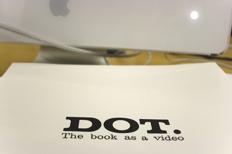
Title
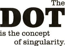
The project’s title “DOT” firstly refers to the name of the song. The dot is also, in the grammatical coding of written language, the end of a sentence, a full stop, point or period, a typographical term in every day life. The “Punkt”, as it is known in German, is not only an element of written language; it is also the noun for the geometrical concept of the “point”, a singularity in space. It refers to an atomar element with an exact location, without volume or length. The DOT is the singular product (a point) in one medium (space) that can be translated into another medium, acquiring a new position in the process.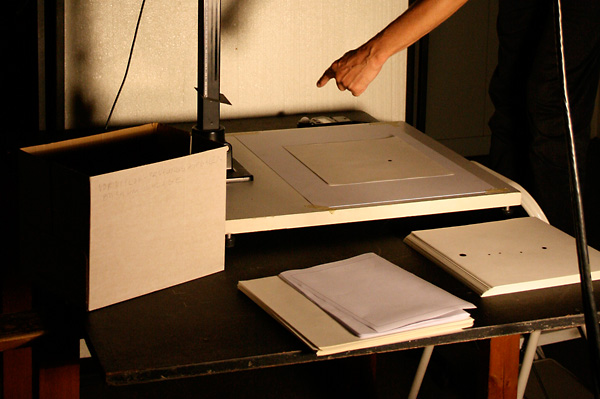
Help
The outcome of this project would have been completely different without the help of many people, most of them from the University of Arts in Braunschweig, Germany. At this point, I would like to express my gratitude to everyone who helped. I would like to introduce them to you in reverse alphabetical order as I did in the video (resistance against the tyranny of the alphabet!) and roughly grouped by function.
Direktör |
|
|
Jörg Petri
|
|
Musique |
|
|
Michael Fakesch
|
|
Typesetting and Printing Division |
|
|
Directrice of awl
|
Felizitas Zechmeister |
|
Best apron Girl
|
Sabrina Wessling |
|
Bäst Boy Electric
|
Sebastian Weiß |
|
Syntactic Mastering
|
Wojciech Stachowiak |
|
Mistress of Speedprinting
|
Nina Schütte |
|
Technical Directrice
|
Sabine Schlimme |
|
Hygiene and Harmony
|
Elke Reinhuber |
|
Lead Operator
|
Nadine Poser |
|
Princess of the Dot
|
Franziska Nast |
|
Visual effects supervisor
|
Rico Lützner |
|
Timing artist
|
Julia Krömer |
|
Petite Part Fancier
|
Jutta Eckel |
Reproduction Division |
|
|
Gaffer second camera
|
Sebastian Lang |
|
Master of Photography
|
Ulli Becker |
Book and binding devision |
|
|
Bookish thinking
|
Ulrike Stoltz |
|
Forewoman of binding
|
Veronika Ruschewski |
Additional support
André Richter
Jan-Frederic Goltz
Lukas von Monkiewitsch
André Richter
Jan-Frederic Goltz
Lukas von Monkiewitsch

